2020 Pantone – Classic Blue

Pantone’s latest shade revisits a colourful classic
With all the craziness dominating current events, most folks responsible for shaping modern culture are clamoring for more calm. That’s probably why the Pantone Color Institute decided on this year’s shade labeled 19-4052, better known as Classic Blue. It’s a peace and tranquil shade, claim the style gurus, a useful hue reliable enough to blend in with other colours. Classic Blue is also versatile enough to be used on any materials from fabric to metal and really makes a harmonic statement in the items shown here.

Pixie Mood Bag-in-Bag “Alicia” Tote, $75 with 42 ‘Pops Pocket’ Cardigan $74 from Saltwater Bay Boutique 
“Xenia” Statement Necklace, $65 with “Double Blue Agate Beads” Earrings $45 from BUNO Design 
HOKA ONE ONE “Speedgoat 4” Women’s Trail Running Shoes, $189.95 with goodr “Falkor’s Fever Dream” Sunglasses $34.95, from Track ’N Trail 
Danesco Mini Spatula, Turner and Whisk, $1.99 each, Switchit 2-in-1 Mini Spoon, $9.49 with Homespun Dishcloths, $9.99 and “Home Sweet Home” Diner Mug, $8.99 from Freson Bros. Fresh Market 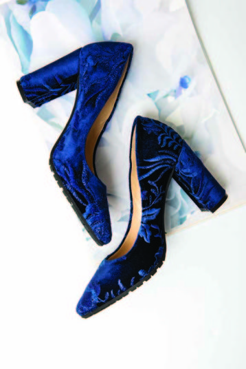
L’Arianna “Velvet Blue” Pump, $280 from Tiramisu Italian Shoes and Accessories 

Kuwallatee “Piece” Hoodie, $80 with Denim Jogger, $110, Adidas Ultraboost Shoes $250 from Legit Kicks 
7 Downie Street “Luxor” Blazer, $350 with BLU Royal Dress Shirt, $116, Eros Bow Ties and Puff Set, $53, J.Grill Pant, $98 and Bench Craft Diamond Buckle Belt, $71 from Knighton Mens Wear
More Like This
PEACH FUZZ
Read
Spring Fashion
Read
Viva Magenta
Read
Upcoming Events
Calendar of Events
S Sun
M Mon
T Tue
W Wed
T Thu
F Fri
S Sat
21 events,
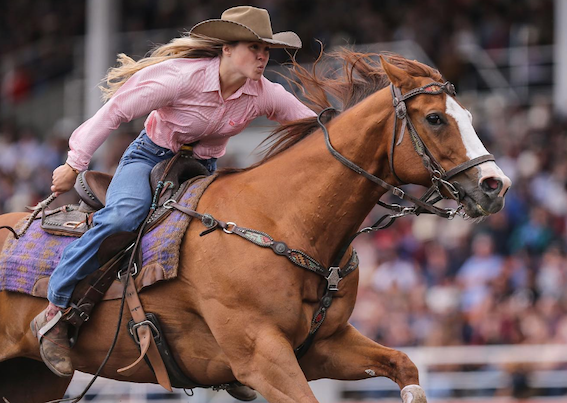
Ponoka Stampede
Ponoka Stampede
One of the largest rodeos in the Country awaits. Entertainment, live music and rodeo. Featuring Craig Moritz. 7:00am-8:00pm Dine at Sixth on the Block Smokehouse in the Tommy Dorchester Paddock …
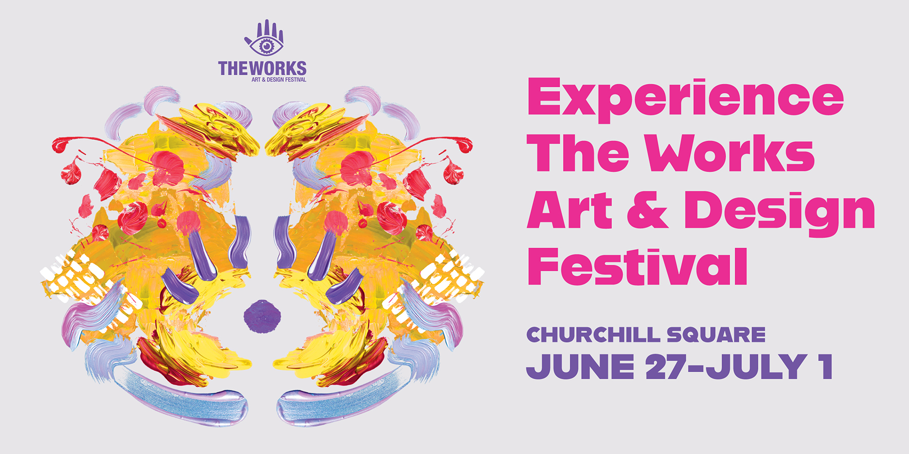
The Works Art & Design Festival
The Works Art & Design Festival
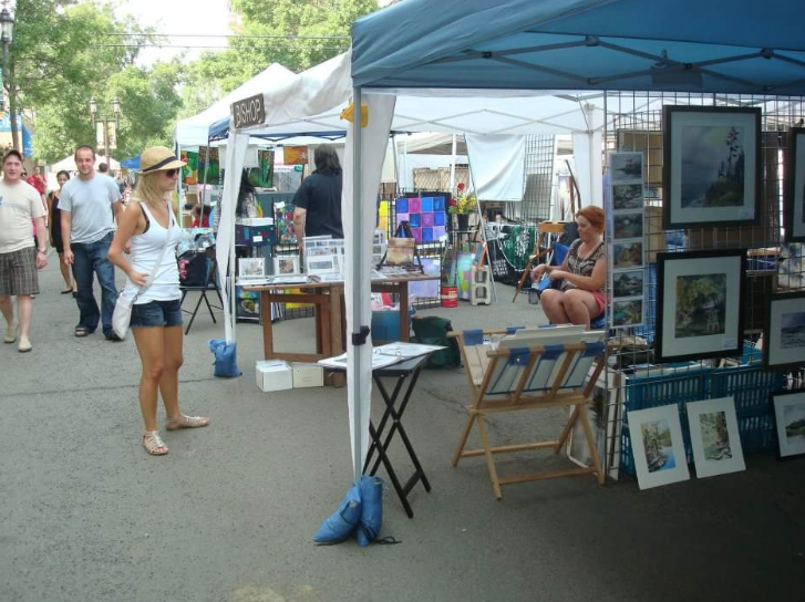
Art is more than what you see… It’s how what you see, hear, or touch… makes you feel. Feel all the colours, textures, sizes and sounds of art at The …
2024 Great Canadian Shoot Out: Basketball Tournament
2024 Great Canadian Shoot Out: Basketball Tournament
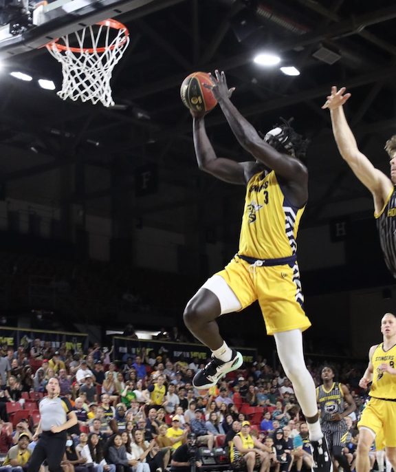
The largest youth basketball tournament in western Canada. • 2400 players • 200 teams • 500 games • 5000 spectators
Ponoka Stampede
Ponoka Stampede
One of the largest rodeos in the Country awaits. Entertainment, live music and rodeo. Featuring Jade Eagleson. 7:00am-8:00pm. Dine at Sixth on the Block Smokehouse in the Tommy Dorchester Paddock …
On Golden Pond
On Golden Pond
On Golden Pond is a timeless, witty comedy that hilariously illustrates the relatable human moments from which life and love are made. Ethel and Norman Thayer return to their summer …
Magnificent River Rats Festival
Magnificent River Rats Festival
Fun for the whole family with a Parade, food fair, market place, parade and live music. - -
Brick Fest Live
Brick Fest Live
See the most life-size models made from tens of thousands of bricks built to unlock your imagination Enjoy hands-on activities and attractions assembled for maximum family-fun Meet contestants from the …
IFAF World U20 Tackle Football Championship
IFAF World U20 Tackle Football Championship
Canada tried to defend it's title. The International Federation of American Football (IFAF) is pleased to announce the return of the IFAF World Junior Championship, This event marks the highly …
IFAF World U20 Tackle Football Championship
IFAF World U20 Tackle Football Championship
Canada tried to defend it's title. The International Federation of American Football (IFAF) is pleased to announce the return of the IFAF World Junior Championship, This event marks the highly …
18 events,
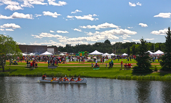
Canada Day Celebration – Lloydminster
Canada Day in Camrose
Canada Day in Camrose
Parade, breakfast, and fun. For updates, additions and details, click HERE
The Works Art & Design Festival
The Works Art & Design Festival
Art is more than what you see… It’s how what you see, hear, or touch… makes you feel. Feel all the colours, textures, sizes and sounds of art at The …
Canada Day – St.Albert
Canada Day – Sherwood Park
Canada Day – Sherwood Park
Join us at Broadmoor Lake Park as we celebrate Canada's birthday at Strathcona County's largest festival. Family activities, performances and fun for everyone! Most activities are free, some require tickets. …
2024 Great Canadian Shoot Out: Basketball Tournament
2024 Great Canadian Shoot Out: Basketball Tournament
The largest youth basketball tournament in western Canada. • 2400 players • 200 teams • 500 games • 5000 spectators
Ponoka Stampede
Ponoka Stampede
One of the largest rodeos in the Country awaits. Entertainment, live music and rodeo. 7:00am - 8:00pm. Dine at Sixth on the Block Smokehouse in the Tommy Dorchester Paddock 8:00am …
Canada Day Kick off, Grande Prairie
Canada Day Kick off, Grande Prairie
A variety of entertainment and activities as well as fireworks, weather and wind permitting, to finish the night at midnight over the reservoir. Plus Parade, downtown Grande Prairie 1 – …
Canada Day – Fort Saskatchewan
Canada Day – Fort Saskatchewan
Pancake Breakfast, parade, car show and shine, great music and fireworks! - 8:00 – 10:00 am Pancake Breakfast – Royal Canadian Legion Parking Lot 9964 93 Avenue 10:00 am - …
Canada Day; Alberta Legislature
Canada Day; Alberta Legislature
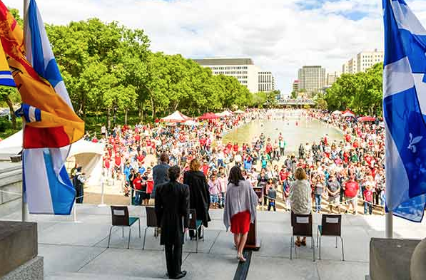
In celebration of Canada's birthday, the Alberta Legislature hosts a variety of activities for the whole family. Visitors will enjoy the annual open house and touring the historic Legislature Building …
Canada Day Weekend, Alberta Railway Museum
Canada Day Weekend, Alberta Railway Museum
What could be more Canadian than the railway? Two ribbons of steel connecting Canada from the Atlantic to the Pacific. This Canada Day weekend at the Alberta Railway Museum, celebrate …
Magnificent River Rats Festival
Magnificent River Rats Festival
Fun for the whole family with a Parade, food fair, market place, parade and live music. - -
2 events,
On Golden Pond
On Golden Pond
On Golden Pond is a timeless, witty comedy that hilariously illustrates the relatable human moments from which life and love are made. Ethel and Norman Thayer return to their summer …
6 events,
On Golden Pond
On Golden Pond
On Golden Pond is a timeless, witty comedy that hilariously illustrates the relatable human moments from which life and love are made. Ethel and Norman Thayer return to their summer …
Little Women The Broadway Musical
Little Women The Broadway Musical
Louisa May Alcott’s timeless, captivating story of the March family is brought to life in this glorious musical filled with personal discovery, heartache and hope. Jo March weaves the story …
On Golden Pond
On Golden Pond
On Golden Pond is a timeless, witty comedy that hilariously illustrates the relatable human moments from which life and love are made. Ethel and Norman Thayer return to their summer …
Journey to the 80’s
Journey to the 80’s
So, DON’T STOP BELIEVIN’, and join us at Jubilations Dinner Theatre as we JOURNEY to the time when we were LIVIN’ ON A PRAYER, and we all had a TOTAL …
Stand Up Comedy featuring headliner Dan Hendricken with Bobby Warrener
Stand Up Comedy featuring headliner Dan Hendricken with Bobby Warrener
Grindstone Comedy Festival https://vimeo.com/313932521
7 events,
Little Women The Broadway Musical
Little Women The Broadway Musical
Louisa May Alcott’s timeless, captivating story of the March family is brought to life in this glorious musical filled with personal discovery, heartache and hope. Jo March weaves the story …
On Golden Pond
On Golden Pond
On Golden Pond is a timeless, witty comedy that hilariously illustrates the relatable human moments from which life and love are made. Ethel and Norman Thayer return to their summer …
Journey to the 80’s
Journey to the 80’s
So, DON’T STOP BELIEVIN’, and join us at Jubilations Dinner Theatre as we JOURNEY to the time when we were LIVIN’ ON A PRAYER, and we all had a TOTAL …
Stand Up Comedy featuring headliner Dave Merheje w/ Sean Lecomber & Kamal Alaeddine
Stand Up Comedy featuring headliner Dave Merheje w/ Sean Lecomber & Kamal Alaeddine
Grindstone Comedy Festival https://www.youtube.com/watch?v=wCi-Lcg4R9w
Cultural Campfires
Cultural Campfires
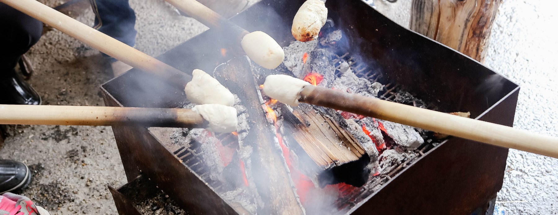
Cultural Campfires have become a community favourite over the summer months. Each week at 7PM in Shikaoi Park, storytellers share stories from an array of cultural backgrounds around the campfire. …
18 events,
Hoop City 3 x 3 basketball
Hoop City 3 x 3 basketball
The 2024 edition of Hoop City 3x3 will feature once again the FIBA 3x3 World Tour, FIBA 3x3 Women’s Series, and the Hoop City 3x3 Tournament, making it the largest …
Bountiful Farmers’ Market
Bountiful Farmers’ Market
Experience Edmonton's Premium Indoor Farmers's Market. You’ll find over 110 of your favorite vendors year-round. More than 80% are local artisans: making, baking and growing their products by themselves: freshly …
Calgary Stampede
Calgary Stampede
One of the world's largest rodeos, a parade, midway, stage shows, concerts, agricultural competitions, chuckwagon racing and First Nations exhibitions. The city takes on a party atmosphere during Stampede: office …
Edmonton International Street Performers
Edmonton International Street Performers
Performers include: 40th Anniversary Celebration Show For 40 years, StreetFest has dazzled audiences with daring and exciting variety performances. Start the Festival off by celebrating with us! After all, you’re …
Little Women The Broadway Musical
Little Women The Broadway Musical
Louisa May Alcott’s timeless, captivating story of the March family is brought to life in this glorious musical filled with personal discovery, heartache and hope. Jo March weaves the story …
27 events,
5 KM Foam Fest
5 KM Foam Fest
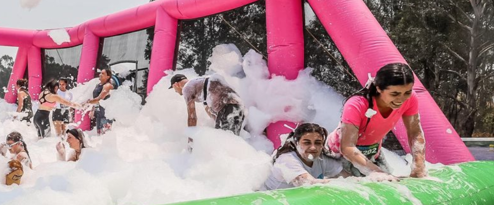
22+ OBSTACLES We guarantee you'll be foamy, muddy and wet by the end of the 5K Foam Fest 5k Foam Fest has 22 of some of the best and most …
Hoop City 3 x 3 basketball
Hoop City 3 x 3 basketball
The 2024 edition of Hoop City 3x3 will feature once again the FIBA 3x3 World Tour, FIBA 3x3 Women’s Series, and the Hoop City 3x3 Tournament, making it the largest …
GranFondo Badlands
GranFondo Badlands
The Drumheller Valley is one with a rich and unique heritage. The dinosaur capital of the world, and some of the most iconic landscapes you will ever encounter. Located a little …
Old Strathcona Farmers Market
Old Strathcona Farmers Market
“Old Strathcona Farmers’ Market is Edmonton’s original, indoor farmers’ market. Located just off historic Whyte Ave, we’ve been operating every Saturday since 1983. With Edmonton’s finest assortment of vendors, we …
Teenage Mutant Kungfu Turtles
Teenage Mutant Kungfu Turtles
The Teenage Mutant Ninja Turtles have lost their groove; crime is all around them, but they are uninspired to stop it. Who should they stumble upon but a Panda with …
Edmonton International Street Performers
Edmonton International Street Performers
Performers include: 40th Anniversary Celebration Show For 40 years, StreetFest has dazzled audiences with daring and exciting variety performances. Start the Festival off by celebrating with us! After all, you’re …
12 events,
Hoop City 3 x 3 basketball
Hoop City 3 x 3 basketball
The 2024 edition of Hoop City 3x3 will feature once again the FIBA 3x3 World Tour, FIBA 3x3 Women’s Series, and the Hoop City 3x3 Tournament, making it the largest …
On Golden Pond
On Golden Pond
On Golden Pond is a timeless, witty comedy that hilariously illustrates the relatable human moments from which life and love are made. Ethel and Norman Thayer return to their summer …
Edmonton International Street Performers
Edmonton International Street Performers
Performers include: 40th Anniversary Celebration Show For 40 years, StreetFest has dazzled audiences with daring and exciting variety performances. Start the Festival off by celebrating with us! After all, you’re …
The Tempest
The Tempest
Magical winds are blowing into your community this summer! This island of magic will move weekly to four amazing communities in Edmonton. Freewill Shakespeare Festival
Edmonton Prospects vs Fort McMurray Giants
Edmonton Prospects vs Fort McMurray Giants
A great evening out watching baseball. Ticket prices range from $15-$20 with children 5 and under being free. Or, a season pass for only $100 + GST. With the purchase …
2 events,
Edmonton International Street Performers
Edmonton International Street Performers
Performers include: 40th Anniversary Celebration Show For 40 years, StreetFest has dazzled audiences with daring and exciting variety performances. Start the Festival off by celebrating with us! After all, you’re …
Shakey Graves in Concert
Shakey Graves in Concert
Shakey Graves, aka Alejandro Rose-Garcia from Austin, Texas, plays a gnarly composite of blues and folk as a one-man-band of epic sonic proportions. The sound emitted from his hollow body …
4 events,
Edmonton International Street Performers
Edmonton International Street Performers
Performers include: 40th Anniversary Celebration Show For 40 years, StreetFest has dazzled audiences with daring and exciting variety performances. Start the Festival off by celebrating with us! After all, you’re …
On Golden Pond
On Golden Pond
On Golden Pond is a timeless, witty comedy that hilariously illustrates the relatable human moments from which life and love are made. Ethel and Norman Thayer return to their summer …
The Play That Goes Wrong
The Play That Goes Wrong
The Cornley Drama Society are putting on a 1920s murder mystery, but as the title suggests, everything that can go wrong… does! The accident-prone thespians battle against all odds to …
11 events,
Lloyd Ex Exhibition – Lloydminster
Lloyd Ex Exhibition – Lloydminster
A parade, West Coast Amusements midway, petting zoo, livestock shows, kids zone, fireworks, dog shows, live entertainment, concerts at the grand stand, and now since 2021 in partnership with The …
On Golden Pond
On Golden Pond
On Golden Pond is a timeless, witty comedy that hilariously illustrates the relatable human moments from which life and love are made. Ethel and Norman Thayer return to their summer …
Edmonton International Street Performers
Edmonton International Street Performers
Performers include: 40th Anniversary Celebration Show For 40 years, StreetFest has dazzled audiences with daring and exciting variety performances. Start the Festival off by celebrating with us! After all, you’re …
Little Women The Broadway Musical
Little Women The Broadway Musical
Louisa May Alcott’s timeless, captivating story of the March family is brought to life in this glorious musical filled with personal discovery, heartache and hope. Jo March weaves the story …
On Golden Pond
On Golden Pond
On Golden Pond is a timeless, witty comedy that hilariously illustrates the relatable human moments from which life and love are made. Ethel and Norman Thayer return to their summer …
11 events,
Edmonton International Street Performers
Edmonton International Street Performers
Performers include: 40th Anniversary Celebration Show For 40 years, StreetFest has dazzled audiences with daring and exciting variety performances. Start the Festival off by celebrating with us! After all, you’re …
Little Women The Broadway Musical
Little Women The Broadway Musical
Louisa May Alcott’s timeless, captivating story of the March family is brought to life in this glorious musical filled with personal discovery, heartache and hope. Jo March weaves the story …
On Golden Pond
On Golden Pond
On Golden Pond is a timeless, witty comedy that hilariously illustrates the relatable human moments from which life and love are made. Ethel and Norman Thayer return to their summer …
Journey to the 80’s
Journey to the 80’s
So, DON’T STOP BELIEVIN’, and join us at Jubilations Dinner Theatre as we JOURNEY to the time when we were LIVIN’ ON A PRAYER, and we all had a TOTAL …
21 events,
Thousand Faces Festival
Thousand Faces Festival
Aesthetically and culturally diverse, the Thousand Faces Festival has given Dancers, Musicians, Poets, Painters, Playwrights and Players space to tell stories from two- minute poems to feature-length multi-disciplinary epics. Many …
2023 Junior Canadian Open Water Ski Championships
2023 Junior Canadian Open Water Ski Championships
The 2-round, world record-capable event will feature U21 Junior Men/Junior Women and U17 Boys/Girls athletes. These extraordinary athletes will be competing for titles in the Slalom, Trick, Jump, and Overall Events. The Jr. Canadian …
Plamondon Mud Bog
Plamondon Mud Bog
For those who love nothing better than to cake their tires — never mind their entire vehicles — in the mud, the Plamondon Mud Bogs are the perfect playground. Afterall, …
Great Outdoors Comedy Festival
Great Outdoors Comedy Festival
Headliners Andrew Schulz - Friday Shane Gillis - Friday Bert Kreischer - Sunday Support Mark Gagnon - Friday Whitney Cummings - Sunday Steph Tolev - Sunday Lisa Gilroy - Sunday
Pembina River Nights
Pembina River Nights
A weekend festival to enjoy the music of The Weber Brothers Samantha Martin Rellik Mike Lynch The Confusionaires Goddamsels Carolyn Mark Wil The Resurgence Darren Johnson Espanola Ava Nayana Jansen …
Whyte Avenue Art-Walk
Whyte Avenue Art-Walk
3 Days, Hundreds of Artists Imagine a 4 km walk through the hearts and minds of artists. Cultural explorers are invited to see art making in action on the …
Edmonton International Street Performers
Edmonton International Street Performers
Performers include: 40th Anniversary Celebration Show For 40 years, StreetFest has dazzled audiences with daring and exciting variety performances. Start the Festival off by celebrating with us! After all, you’re …
Little Women The Broadway Musical
Little Women The Broadway Musical
Louisa May Alcott’s timeless, captivating story of the March family is brought to life in this glorious musical filled with personal discovery, heartache and hope. Jo March weaves the story …
Ravenwood Experience
Ravenwood Experience
Today's performers Friday July 12th Set Times (Subject to Change) 4:30 - 5:30 Crescendo Music Studios 6:00 - 7:00. Damn Near Famous 7:30 - 9:00. Carter & the Capitals 9:30 …
30 events,
Summer Sizzler Rodeo – Lamont
Summer Sizzler Rodeo – Lamont
There won’t be a demolition derby this year, but there’ll still be the Combine Crunch, Bench Show and Saturday Rodeo.
Thousand Faces Festival
Thousand Faces Festival
Aesthetically and culturally diverse, the Thousand Faces Festival has given Dancers, Musicians, Poets, Painters, Playwrights and Players space to tell stories from two- minute poems to feature-length multi-disciplinary epics. Many …
2023 Junior Canadian Open Water Ski Championships
2023 Junior Canadian Open Water Ski Championships
The 2-round, world record-capable event will feature U21 Junior Men/Junior Women and U17 Boys/Girls athletes. These extraordinary athletes will be competing for titles in the Slalom, Trick, Jump, and Overall Events. The Jr. Canadian …
Pembina River Nights
Pembina River Nights
A weekend festival to enjoy the music of The Weber Brothers Samantha Martin Rellik Mike Lynch The Confusionaires Goddamsels Carolyn Mark Wil The Resurgence Darren Johnson Espanola Ava Nayana Jansen …
Old Strathcona Farmers Market
Old Strathcona Farmers Market
“Old Strathcona Farmers’ Market is Edmonton’s original, indoor farmers’ market. Located just off historic Whyte Ave, we’ve been operating every Saturday since 1983. With Edmonton’s finest assortment of vendors, we …
Bubble Chase 5 Km – Airdrie
Bubble Chase 5 Km – Airdrie
Run, jog, walk, dance or toddle around the course and through each of our coloured Bubble Stations: There will be colourful bubbles and music at each of our four stations. …
Whyte Avenue Art-Walk
Whyte Avenue Art-Walk
3 Days, Hundreds of Artists Imagine a 4 km walk through the hearts and minds of artists. Cultural explorers are invited to see art making in action on the …
Teenage Mutant Kungfu Turtles
Teenage Mutant Kungfu Turtles
The Teenage Mutant Ninja Turtles have lost their groove; crime is all around them, but they are uninspired to stop it. Who should they stumble upon but a Panda with …
Edmonton International Street Performers
Edmonton International Street Performers
Performers include: 40th Anniversary Celebration Show For 40 years, StreetFest has dazzled audiences with daring and exciting variety performances. Start the Festival off by celebrating with us! After all, you’re …
19 events,
Pembina River Nights
Thousand Faces Festival
Thousand Faces Festival
Aesthetically and culturally diverse, the Thousand Faces Festival has given Dancers, Musicians, Poets, Painters, Playwrights and Players space to tell stories from two- minute poems to feature-length multi-disciplinary epics. Many …
2023 Junior Canadian Open Water Ski Championships
2023 Junior Canadian Open Water Ski Championships
The 2-round, world record-capable event will feature U21 Junior Men/Junior Women and U17 Boys/Girls athletes. These extraordinary athletes will be competing for titles in the Slalom, Trick, Jump, and Overall Events. The Jr. Canadian …
Ukrainian Village Music Fest
Ukrainian Village Music Fest
Founded in 1986, the Ukrainian Village Music Fest (formerly known as the Friends Ukrainian Music Fest), is a multi-genre music festival held in support of the Ukrainian Cultural Heritage Village. …
On Golden Pond
On Golden Pond
On Golden Pond is a timeless, witty comedy that hilariously illustrates the relatable human moments from which life and love are made. Ethel and Norman Thayer return to their summer …
Edmonton International Street Performers
Edmonton International Street Performers
Performers include: 40th Anniversary Celebration Show For 40 years, StreetFest has dazzled audiences with daring and exciting variety performances. Start the Festival off by celebrating with us! After all, you’re …
Whyte Avenue Art-Walk
Whyte Avenue Art-Walk
3 Days, Hundreds of Artists Imagine a 4 km walk through the hearts and minds of artists. Cultural explorers are invited to see art making in action on the …
Monster Jam
Monster Jam
Fans can see the massive trucks up close, meet their favourite drivers and crews, get autographs, and take pictures. Activities include the Sand Box play area, UNOH tire demonstration, colouring …
1 event,
The Magpie Collection: A Dance Festival
The Magpie Collection: A Dance Festival
The Magpie Collection is a bright and attractive gathering of dances that will inspire, delight, and move audiences with the language of dance which crosses many boundaries. Look for workshops …
6 events,
On Golden Pond
On Golden Pond
On Golden Pond is a timeless, witty comedy that hilariously illustrates the relatable human moments from which life and love are made. Ethel and Norman Thayer return to their summer …
Edmonton Prospects vs Saskatoon Berries
Edmonton Prospects vs Saskatoon Berries
A great evening out watching baseball. Ticket prices range from $15-$20 with children 5 and under being free. Or, a season pass for only $100 + GST. With the purchase …
The Magpie Collection: A Dance Festival
The Magpie Collection: A Dance Festival
The Magpie Collection is a bright and attractive gathering of dances that will inspire, delight, and move audiences with the language of dance which crosses many boundaries. Look for workshops …
Pallbearer
Pallbearer
Pallbearer are a doom metal band from Little Rock, Arkansas. Formed in 2008, Pallbearer have gone on to release four full-length albums that have garnered a great deal of success among …
The Play That Goes Wrong
The Play That Goes Wrong
The Cornley Drama Society are putting on a 1920s murder mystery, but as the title suggests, everything that can go wrong… does! The accident-prone thespians battle against all odds to …
12 events,
Westerner Days – Red Deer
Westerner Days – Red Deer
A summer celebration with five days of top quality, truly authentic, action-packed entertainment! This event has everything that people are looking for in summer festivities – live entertainment, midway rides, …
On Golden Pond
On Golden Pond
On Golden Pond is a timeless, witty comedy that hilariously illustrates the relatable human moments from which life and love are made. Ethel and Norman Thayer return to their summer …
Little Women The Broadway Musical
Little Women The Broadway Musical
Louisa May Alcott’s timeless, captivating story of the March family is brought to life in this glorious musical filled with personal discovery, heartache and hope. Jo March weaves the story …
On Golden Pond
On Golden Pond
On Golden Pond is a timeless, witty comedy that hilariously illustrates the relatable human moments from which life and love are made. Ethel and Norman Thayer return to their summer …
14 events,
Westerner Days – Red Deer
Westerner Days – Red Deer
A summer celebration with five days of top quality, truly authentic, action-packed entertainment! This event has everything that people are looking for in summer festivities – live entertainment, midway rides, …
Taste of Edmonton
Taste of Edmonton
Tasty Food from dozens of restaurants in the core of Edmonton. Plus, live music entertainment nightly. $2 per food ticket, or 20 tickets for $36
Little Women The Broadway Musical
Little Women The Broadway Musical
Louisa May Alcott’s timeless, captivating story of the March family is brought to life in this glorious musical filled with personal discovery, heartache and hope. Jo March weaves the story …
On Golden Pond
On Golden Pond
On Golden Pond is a timeless, witty comedy that hilariously illustrates the relatable human moments from which life and love are made. Ethel and Norman Thayer return to their summer …
21 events,
K-Days
K-Days
Edmonton’s extravaganza of rides, games, music, food and adventure. The rides and games alone will leave you breathless and wanting more. Watch as fireworks light up the night sky and …
Hardisty Rodeo
Hardisty Rodeo
If rodeo is your sport, plan to be in Hardisty the third weekend of July as we "whoop" it up at our annual Rodeo. The weekend features a pancake breakfast, …
Westerner Days – Red Deer
Westerner Days – Red Deer
A summer celebration with five days of top quality, truly authentic, action-packed entertainment! This event has everything that people are looking for in summer festivities – live entertainment, midway rides, …
Wild Mountain Music Festival, Hinton
Wild Mountain Music Festival, Hinton
The location is rustic and takes place on one of the pastures of a working ranch. Wild Mountain happens at the Entrance Ranch, eight kilometers north of Hinton, on the most beautiful …
Taste of Edmonton
Taste of Edmonton
Tasty Food from dozens of restaurants in the core of Edmonton. Plus, live music entertainment nightly. $2 per food ticket, or 20 tickets for $36
Little Women The Broadway Musical
Little Women The Broadway Musical
Louisa May Alcott’s timeless, captivating story of the March family is brought to life in this glorious musical filled with personal discovery, heartache and hope. Jo March weaves the story …
30 events,
Cold Lake Airshow
Cold Lake Airshow
Featured performers include: Frecce Tricolori The renowned Frecce Tricolori, Italy’s elite aerobatic demonstration team, is set to take to the skies at the Cold Lake Air Show. For over 60 …
K-Days
K-Days
Edmonton’s extravaganza of rides, games, music, food and adventure. The rides and games alone will leave you breathless and wanting more. Watch as fireworks light up the night sky and …
Edmonton Reggae Festival
Edmonton Reggae Festival
Get ready to party with Destra Garcia, Singing Melody, The Melisizwe Brothers, Kianna Faith, Harold Fast, Empress Nyiringango and many more! Featuring Empress Nyiringango From Ottawa, way of Rwanda Destra …
EDMONTON CARNAVAL
EDMONTON CARNAVAL
Join Alberta's best Latin carnival, full of fun, culture and live music. Let's celebrate the rich tradition with a tribute to Latin cumbia with musical shows that will make you vibrate! Plus, …
Westerner Days – Red Deer
Westerner Days – Red Deer
A summer celebration with five days of top quality, truly authentic, action-packed entertainment! This event has everything that people are looking for in summer festivities – live entertainment, midway rides, …
Old Strathcona Farmers Market
Old Strathcona Farmers Market
“Old Strathcona Farmers’ Market is Edmonton’s original, indoor farmers’ market. Located just off historic Whyte Ave, we’ve been operating every Saturday since 1983. With Edmonton’s finest assortment of vendors, we …
Bubble Chase 5 k
Bubble Chase 5 k
Run, walk and play in massive colourful bubble bogs through a 2.5k or 5k course. Bubble Chase is a run with a major twist! Start in a sea of bubbles …
Tails on the Trails Paws-a-thon
Tails on the Trails Paws-a-thon
The event includes a fun evening of food & drinks, activities, vendors, music and much more! The walk will officially start at 4:00 pm, but you may walk at your …
Wild Mountain Music Festival, Hinton
Wild Mountain Music Festival, Hinton
The location is rustic and takes place on one of the pastures of a working ranch. Wild Mountain happens at the Entrance Ranch, eight kilometers north of Hinton, on the most beautiful …
18 events,
EDMONTON CARNAVAL
Edmonton Reggae Festival
Edmonton Reggae Festival
Get ready to party with Destra Garcia, Singing Melody, The Melisizwe Brothers, Kianna Faith, Harold Fast, Empress Nyiringango and many more! Featuring Empress Nyiringango From Ottawa, way of Rwanda Destra …
Cold Lake Airshow
Cold Lake Airshow
Featured performers include: Frecce Tricolori The renowned Frecce Tricolori, Italy’s elite aerobatic demonstration team, is set to take to the skies at the Cold Lake Air Show. For over 60 …
K-Days
K-Days
Edmonton’s extravaganza of rides, games, music, food and adventure. The rides and games alone will leave you breathless and wanting more. Watch as fireworks light up the night sky and …
EDMONTON CARNAVAL
EDMONTON CARNAVAL
Join Alberta's best Latin carnival, full of fun, culture and live music. Let's celebrate the rich tradition with a tribute to Latin cumbia with musical shows that will make you vibrate! Plus, …
Westerner Days – Red Deer
Westerner Days – Red Deer
A summer celebration with five days of top quality, truly authentic, action-packed entertainment! This event has everything that people are looking for in summer festivities – live entertainment, midway rides, …
Wild Mountain Music Festival, Hinton
Wild Mountain Music Festival, Hinton
The location is rustic and takes place on one of the pastures of a working ranch. Wild Mountain happens at the Entrance Ranch, eight kilometers north of Hinton, on the most beautiful …
On Golden Pond
On Golden Pond
On Golden Pond is a timeless, witty comedy that hilariously illustrates the relatable human moments from which life and love are made. Ethel and Norman Thayer return to their summer …
Taste of Edmonton
Taste of Edmonton
Tasty Food from dozens of restaurants in the core of Edmonton. Plus, live music entertainment nightly. $2 per food ticket, or 20 tickets for $36
5 events,
K-Days
K-Days
Edmonton’s extravaganza of rides, games, music, food and adventure. The rides and games alone will leave you breathless and wanting more. Watch as fireworks light up the night sky and …
Taste of Edmonton
Taste of Edmonton
Tasty Food from dozens of restaurants in the core of Edmonton. Plus, live music entertainment nightly. $2 per food ticket, or 20 tickets for $36
The Magpie Collection: A Dance Festival
The Magpie Collection: A Dance Festival
The Magpie Collection is a bright and attractive gathering of dances that will inspire, delight, and move audiences with the language of dance which crosses many boundaries. Look for workshops …
7 events,
K-Days
K-Days
Edmonton’s extravaganza of rides, games, music, food and adventure. The rides and games alone will leave you breathless and wanting more. Watch as fireworks light up the night sky and …
Taste of Edmonton
Taste of Edmonton
Tasty Food from dozens of restaurants in the core of Edmonton. Plus, live music entertainment nightly. $2 per food ticket, or 20 tickets for $36
On Golden Pond
On Golden Pond
On Golden Pond is a timeless, witty comedy that hilariously illustrates the relatable human moments from which life and love are made. Ethel and Norman Thayer return to their summer …
The Magpie Collection: A Dance Festival
The Magpie Collection: A Dance Festival
The Magpie Collection is a bright and attractive gathering of dances that will inspire, delight, and move audiences with the language of dance which crosses many boundaries. Look for workshops …
The Play That Goes Wrong
The Play That Goes Wrong
The Cornley Drama Society are putting on a 1920s murder mystery, but as the title suggests, everything that can go wrong… does! The accident-prone thespians battle against all odds to …
12 events,
K-Days
K-Days
Edmonton’s extravaganza of rides, games, music, food and adventure. The rides and games alone will leave you breathless and wanting more. Watch as fireworks light up the night sky and …
On Golden Pond
On Golden Pond
On Golden Pond is a timeless, witty comedy that hilariously illustrates the relatable human moments from which life and love are made. Ethel and Norman Thayer return to their summer …
Taste of Edmonton
Taste of Edmonton
Tasty Food from dozens of restaurants in the core of Edmonton. Plus, live music entertainment nightly. $2 per food ticket, or 20 tickets for $36
Little Women The Broadway Musical
Little Women The Broadway Musical
Louisa May Alcott’s timeless, captivating story of the March family is brought to life in this glorious musical filled with personal discovery, heartache and hope. Jo March weaves the story …
On Golden Pond
On Golden Pond
On Golden Pond is a timeless, witty comedy that hilariously illustrates the relatable human moments from which life and love are made. Ethel and Norman Thayer return to their summer …
13 events,
K-Days
K-Days
Edmonton’s extravaganza of rides, games, music, food and adventure. The rides and games alone will leave you breathless and wanting more. Watch as fireworks light up the night sky and …
Calgary Folk Music Fest
Calgary Folk Music Fest
The annual Festival is a four-day family-friendly cultural and musical extravaganza. Featuring 70 artists from Alberta, Canada, and the world performing on five daytime and two evening stages in concerts …
Taste of Edmonton
Taste of Edmonton
Tasty Food from dozens of restaurants in the core of Edmonton. Plus, live music entertainment nightly. $2 per food ticket, or 20 tickets for $36
Little Women The Broadway Musical
Little Women The Broadway Musical
Louisa May Alcott’s timeless, captivating story of the March family is brought to life in this glorious musical filled with personal discovery, heartache and hope. Jo March weaves the story …
On Golden Pond
On Golden Pond
On Golden Pond is a timeless, witty comedy that hilariously illustrates the relatable human moments from which life and love are made. Ethel and Norman Thayer return to their summer …
17 events,
Vermilion Fair
Vermilion Fair
A parade, beginning at 11:00 am Thursday and lasting about one hour, marks the beginning of our fair. Chariots run each afternoon starting at 1:30 pm. The grandstand runs all three days of …
K-Days
K-Days
Edmonton’s extravaganza of rides, games, music, food and adventure. The rides and games alone will leave you breathless and wanting more. Watch as fireworks light up the night sky and …
BLUE SUEDE MUSIC FESTIVAL
BLUE SUEDE MUSIC FESTIVAL
The best music created, presented by anywhere from 14-20 Elvis Tribute Artists from all over Canada and the US!
FETE AU VILLAGE
FETE AU VILLAGE
Fête Au Village annual festival in the Town of Legal, Alberta. Celebrating the community & surrounding area, the festival welcomes all while creating lasting memories in celebration of the community. …
Taste of Edmonton
Taste of Edmonton
Tasty Food from dozens of restaurants in the core of Edmonton. Plus, live music entertainment nightly. $2 per food ticket, or 20 tickets for $36
Little Women The Broadway Musical
Little Women The Broadway Musical
Louisa May Alcott’s timeless, captivating story of the March family is brought to life in this glorious musical filled with personal discovery, heartache and hope. Jo March weaves the story …
On Golden Pond
On Golden Pond
On Golden Pond is a timeless, witty comedy that hilariously illustrates the relatable human moments from which life and love are made. Ethel and Norman Thayer return to their summer …
Journey to the 80’s
Journey to the 80’s
So, DON’T STOP BELIEVIN’, and join us at Jubilations Dinner Theatre as we JOURNEY to the time when we were LIVIN’ ON A PRAYER, and we all had a TOTAL …
20 events,
CentreFest
CentreFest
Street performing or busking is an ancient form of entertainment. It is a style like no other. Street performers are that rare breed of entertainer in search of the best …
K-Days
K-Days
Edmonton’s extravaganza of rides, games, music, food and adventure. The rides and games alone will leave you breathless and wanting more. Watch as fireworks light up the night sky and …
Vermilion Fair
Vermilion Fair
A parade, beginning at 11:00 am Thursday and lasting about one hour, marks the beginning of our fair. Chariots run each afternoon starting at 1:30 pm. The grandstand runs all three days of …
Cochrane Fair
Cochrane Fair
Cochrane Ag Society Grounds (northwest corner of Hwys 1A and 22) It will feature the Excel Homes Special Events Stage, Children Fun Zone, lots of equestrian events including Jackpot …
Old Strathcona Farmers Market
Old Strathcona Farmers Market
“Old Strathcona Farmers’ Market is Edmonton’s original, indoor farmers’ market. Located just off historic Whyte Ave, we’ve been operating every Saturday since 1983. With Edmonton’s finest assortment of vendors, we …
Edmonton Ice Cream Run
Edmonton Ice Cream Run
Registration required. Run for free ice cream! Take part in this great family event. Details HERE
Taste of Edmonton
Taste of Edmonton
Tasty Food from dozens of restaurants in the core of Edmonton. Plus, live music entertainment nightly. $2 per food ticket, or 20 tickets for $36
Teenage Mutant Kungfu Turtles
Teenage Mutant Kungfu Turtles
The Teenage Mutant Ninja Turtles have lost their groove; crime is all around them, but they are uninspired to stop it. Who should they stumble upon but a Panda with …
Little Women The Broadway Musical
Little Women The Broadway Musical
Louisa May Alcott’s timeless, captivating story of the March family is brought to life in this glorious musical filled with personal discovery, heartache and hope. Jo March weaves the story …
15 events,
K-Days
K-Days
Edmonton’s extravaganza of rides, games, music, food and adventure. The rides and games alone will leave you breathless and wanting more. Watch as fireworks light up the night sky and …
Vermilion Fair
Vermilion Fair
A parade, beginning at 11:00 am Thursday and lasting about one hour, marks the beginning of our fair. Chariots run each afternoon starting at 1:30 pm. The grandstand runs all three days of …
CentreFest
CentreFest
Street performing or busking is an ancient form of entertainment. It is a style like no other. Street performers are that rare breed of entertainer in search of the best …
On Golden Pond
On Golden Pond
On Golden Pond is a timeless, witty comedy that hilariously illustrates the relatable human moments from which life and love are made. Ethel and Norman Thayer return to their summer …
Taste of Edmonton
Taste of Edmonton
Tasty Food from dozens of restaurants in the core of Edmonton. Plus, live music entertainment nightly. $2 per food ticket, or 20 tickets for $36
The Play That Goes Wrong
The Play That Goes Wrong
The Cornley Drama Society are putting on a 1920s murder mystery, but as the title suggests, everything that can go wrong… does! The accident-prone thespians battle against all odds to …
Edmonton Elks vs Hamilton Tiger Cats
Edmonton Elks vs Hamilton Tiger Cats
Celebrate a beautiful summer night with a trouncing of some eastern kittie cats.
2 events,
Edmonton Prospects vs Brooks Bombers
Edmonton Prospects vs Brooks Bombers
A great evening out watching baseball. Ticket prices range from $15-$20 with children 5 and under being free. Or, a season pass for only $100 + GST. With the purchase …
The Play That Goes Wrong
The Play That Goes Wrong
The Cornley Drama Society are putting on a 1920s murder mystery, but as the title suggests, everything that can go wrong… does! The accident-prone thespians battle against all odds to …
5 events,
Little Women The Broadway Musical
Little Women The Broadway Musical
Louisa May Alcott’s timeless, captivating story of the March family is brought to life in this glorious musical filled with personal discovery, heartache and hope. Jo March weaves the story …
Journey to the 80’s
Journey to the 80’s
So, DON’T STOP BELIEVIN’, and join us at Jubilations Dinner Theatre as we JOURNEY to the time when we were LIVIN’ ON A PRAYER, and we all had a TOTAL …
Edmonton Prospects vs Brooks Bombers
Edmonton Prospects vs Brooks Bombers
A great evening out watching baseball. Ticket prices range from $15-$20 with children 5 and under being free. Or, a season pass for only $100 + GST. With the purchase …
The Play That Goes Wrong
The Play That Goes Wrong
The Cornley Drama Society are putting on a 1920s murder mystery, but as the title suggests, everything that can go wrong… does! The accident-prone thespians battle against all odds to …
9 events,
Big Valley Jamboree
Big Valley Jamboree
The Country music festival upon which all others are judged. Amazing music and fun things to do and see including Multiple stages, kids activities, marketplace, parade, and, of course, some …
Kick’n Country Parade
Little Women The Broadway Musical
Little Women The Broadway Musical
Louisa May Alcott’s timeless, captivating story of the March family is brought to life in this glorious musical filled with personal discovery, heartache and hope. Jo March weaves the story …
Calgary Blues Festival
Calgary Blues Festival
Calgary Bluesfest is a week-long celebration of blues events, culminating in 4 days and nights of non-stop music on MainStage, followed by the nightly Twilight Blues dance parties. Mainstage Mainstage …
Journey to the 80’s
Journey to the 80’s
So, DON’T STOP BELIEVIN’, and join us at Jubilations Dinner Theatre as we JOURNEY to the time when we were LIVIN’ ON A PRAYER, and we all had a TOTAL …
Cultural Campfires
Cultural Campfires
Cultural Campfires have become a community favourite over the summer months. Each week at 7PM in Shikaoi Park, storytellers share stories from an array of cultural backgrounds around the campfire. …
10 events,
Big Valley Jamboree
Big Valley Jamboree
The Country music festival upon which all others are judged. Amazing music and fun things to do and see including Multiple stages, kids activities, marketplace, parade, and, of course, some …
Loud as Hell Music Festival
Loud as Hell Music Festival
"The Loud As Hell Festival in Drumheller, Alberta, Canada is one of the top underground metal festivals in the country... it's a metal family reunion!"
Little Women The Broadway Musical
Little Women The Broadway Musical
Louisa May Alcott’s timeless, captivating story of the March family is brought to life in this glorious musical filled with personal discovery, heartache and hope. Jo March weaves the story …
Calgary Blues Festival
Calgary Blues Festival
Calgary Bluesfest is a week-long celebration of blues events, culminating in 4 days and nights of non-stop music on MainStage, followed by the nightly Twilight Blues dance parties. Mainstage Mainstage …
Blueberry Music Festival
Blueberry Music Festival
Three days of amazing music on three stages. Bring the family, a chair, everything you play and a great big smile. Food Trucks, 4o market vendors, family events, workshops, and …
14 events,
Big Valley Jamboree
Big Valley Jamboree
The Country music festival upon which all others are judged. Amazing music and fun things to do and see including Multiple stages, kids activities, marketplace, parade, and, of course, some …
Aqua Days – Cold Lake
Aqua Days – Cold Lake
Held on the August (Heritage Day) long weekend at Kinosoo Beach, Aqua Days offers something for each and every member of the family. Live stage entertainment, a vendor market, free water …
Canadian Death Race, Grande Cache
Canadian Death Race, Grande Cache
The 125 km course begins and ends on a 4200 foot plateau, passes over three mountain summits and includes over 17,000 feet of elevation change and a major river crossing …
Old Strathcona Farmers Market
Old Strathcona Farmers Market
“Old Strathcona Farmers’ Market is Edmonton’s original, indoor farmers’ market. Located just off historic Whyte Ave, we’ve been operating every Saturday since 1983. With Edmonton’s finest assortment of vendors, we …
Loud as Hell Music Festival
Loud as Hell Music Festival
"The Loud As Hell Festival in Drumheller, Alberta, Canada is one of the top underground metal festivals in the country... it's a metal family reunion!"
Teenage Mutant Kungfu Turtles
Teenage Mutant Kungfu Turtles
The Teenage Mutant Ninja Turtles have lost their groove; crime is all around them, but they are uninspired to stop it. Who should they stumble upon but a Panda with …
Calgary Blues Festival
Calgary Blues Festival
Calgary Bluesfest is a week-long celebration of blues events, culminating in 4 days and nights of non-stop music on MainStage, followed by the nightly Twilight Blues dance parties. Mainstage 1:00 …
Blueberry Music Festival
Blueberry Music Festival
Three days of amazing music on three stages. Bring the family, a chair, everything you play and a great big smile. Food Trucks, 4o market vendors, family events, workshops, and …


